Early 2018, Morether was asked to redesign the logo for McLane Children's Hospital in Temple, TX. McLane Children's is part of Baylor Scott & White Health. We invite you to read how this ride unfolded.
In February we were called by Drayton McLane's office of McLane Group for a meeting to discuss "signage for the hospital." We're thinking name placards or maybe way-finding signage. I mean, we're a small 2-person agency, what more could it be?
A Wonderfully Challenging Project
Turns out it was more than name plates. Several minutes into the meeting I realized it was a rebranding project for a local hospital. This hospital is part of the largest hospital group in Texas: Baylor Scott & White.
After working with The McLane Group on their custom Christmas cards for clients, this was slightly bigger and an amazing opportunity.
McLane Children's owes its namesake to Drayton McLane, a local businessman/philanthropist/icon in Central Texas. Mr. McLane provided key funding and vision in building McLane Children's. The grand scheme is to become a destination for children's health for all Texans – particularly in the gap between Dallas and Austin.
In fact, while in the midst of this project, my family utilized McLane Children's for my daughter's eye surgery. We were grateful to have fantastic healthcare so close.
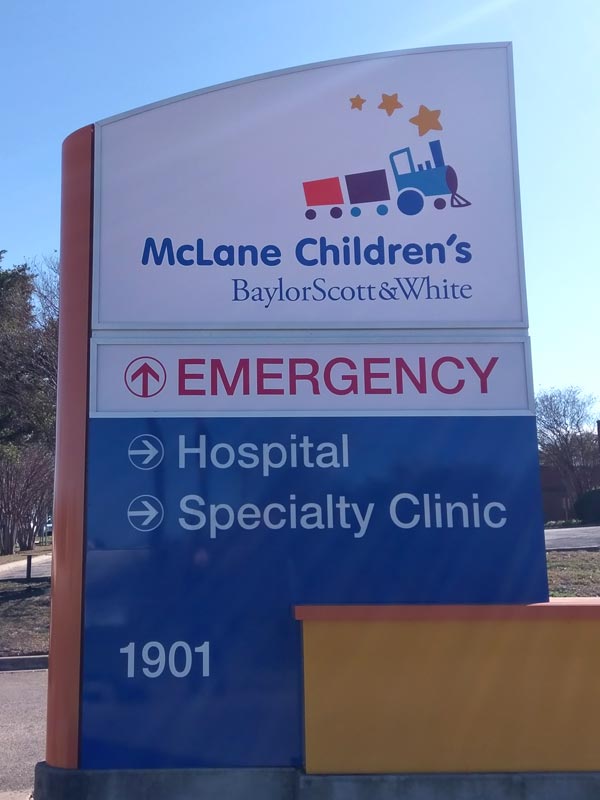
Eyes of a Child
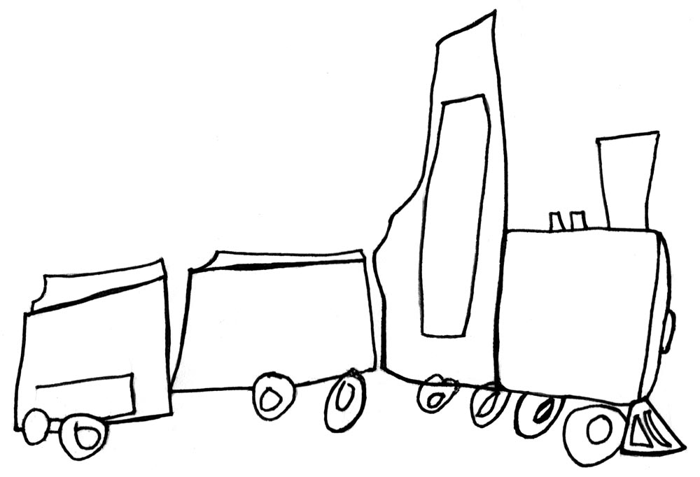
Speaking of my daughter's eyes, when pondering concepts for the branding of McLane Children's, I turned to my kids for their perspective. If kids are the primary visitors, then the hospital image needs to resonate with them first. They need to experience a sense of joy, comfort, and wonder in their surroundings – particularly in the midst of what might be the most difficult time of their life.
So, I asked my kids to compose a drawing of a train.
Temple, TX is a railroad city. It was forged through the railroad. We hear the rumble of the engine and railroad cars every day near our house.
Kids love the mystery and thrill of a train. There's adventure and excitement wrapped in a train ride.
It seemed ideal for McLane Children's logo branding. And when rendered with the artistic skill of a 4 & 7-year old, it's perfect.
A Ride to the Finish
Mr. McLane agreed. As did the marketing director and team at Baylor Scott & White.
We won't bore you with the full scope of the next 8 months of developing the branding package and external signage. However, it is worth mentioning that we've never been part of a branding process for such a large organization. This was new territory. So we worked with the pros at Baylor Scott & White's go-to design agency, Siegel+Gale. They worked through initial research, trademarking, refinement and designing the branding guidelines and beyond. They were fantastic. We learned much through them.
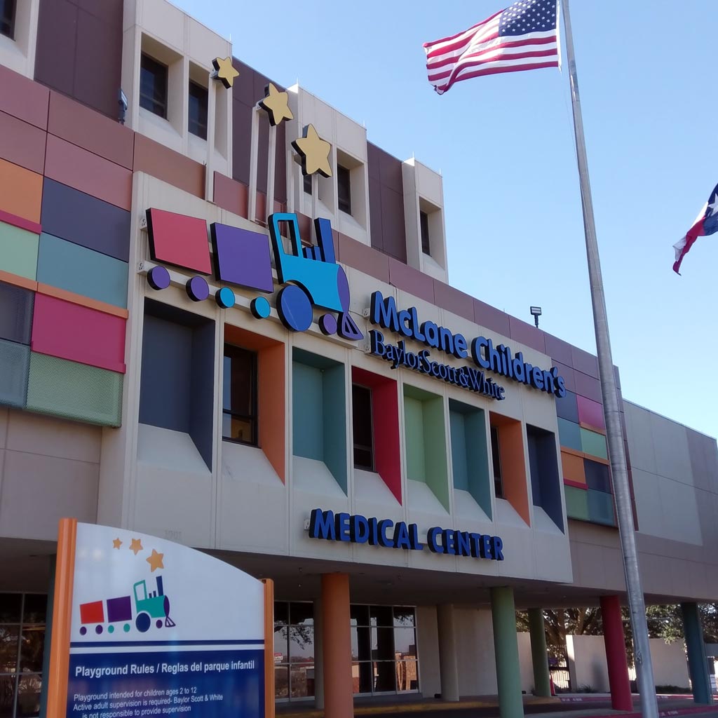
And now the "choo choo" rides high in the sky at McLane Children's. My kids squeal every time we drive by knowing they helped "design" the new logo. And they remind everyone of their 15 minutes of fame (read – 15 seconds) at the "unveiling" ceremony with local news stations and a photo opp.
![]()
We're grateful to Mr. McLane, Baylor Scott & White, and Siegel+Gale for the exciting journey of designing something so meaningful for our agency, our city and our children.